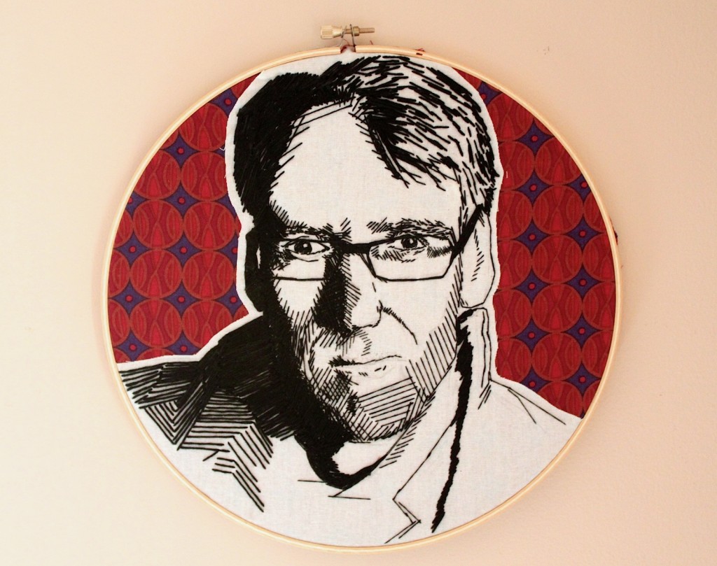
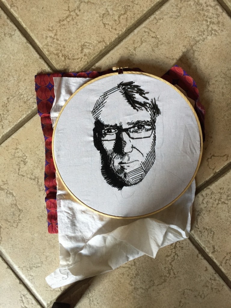
The image on the cover of my first e-book, ROCK STARS OF WINE AMERICA #1 pictured above, has already got a lot of comment and I felt that I must tell the story of how it came about. By chance a friend in NYWC (New York Wine City) recently introduced me to Angelyn Cabrales, a young Philippine-American artist who is still studying in New Jersey. We were having brunch in a waterfront restaurant and in spite of all the distractions it didn’t take long before Angelyn showed me some of her work on her iPhone. Her circular portraits were like nothing I’ve ever seen before, and I was immediately very excited, not least because of the medium. It was clear to me from the first glance that although they looked like drawings or collages involving drawing, in fact they were stitched. I recognized the embroidery hoop and metal clip with a screw that hold the cloth tight in a circle from school. As a child, I’d done some embroidery, but of a much more basic kind than this.
I asked Angelyn to email me some photos of her work, and I saw them at home on my computer screen I knew that I would be commissioning one of these works for the cover of my first e-book for Kindle. At this point I’d already asked Alexandra Weiss of Weisswieschwarz to design a logo for the series that would harmonize with the STUART PIGOTT RIESLING GLOBAL logo that previously stood at the masthead of this ship. I was also into the final round of corrections to the manuscript and it was clear to me that the PARENTAL ADVISORY Explicit Content sign would need to go on the cover, not least because of paragraph one of the main Text (there is an introduction before that disturbing pornographic moment). Suddenly, I had a concept for the cover, Alexandra Weiss agreed to do the design work, and all I needed was a portrait of me by Angelyn, since I am the main character in ROCK STARS OF WINE AMERICA #1. She worked very quickly and I collected it from her at Caffe Reggio in Greenwich Village just over a month ago. As soon as I saw it I knew that it was absolutely right. Shortly after that she sent me the following series of photos of its creation.
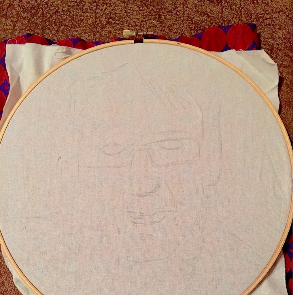
At this early stage only the vaguest tentative outlines of the image are present, and you really couldn’t imagine what was coming if you didn’t know already.
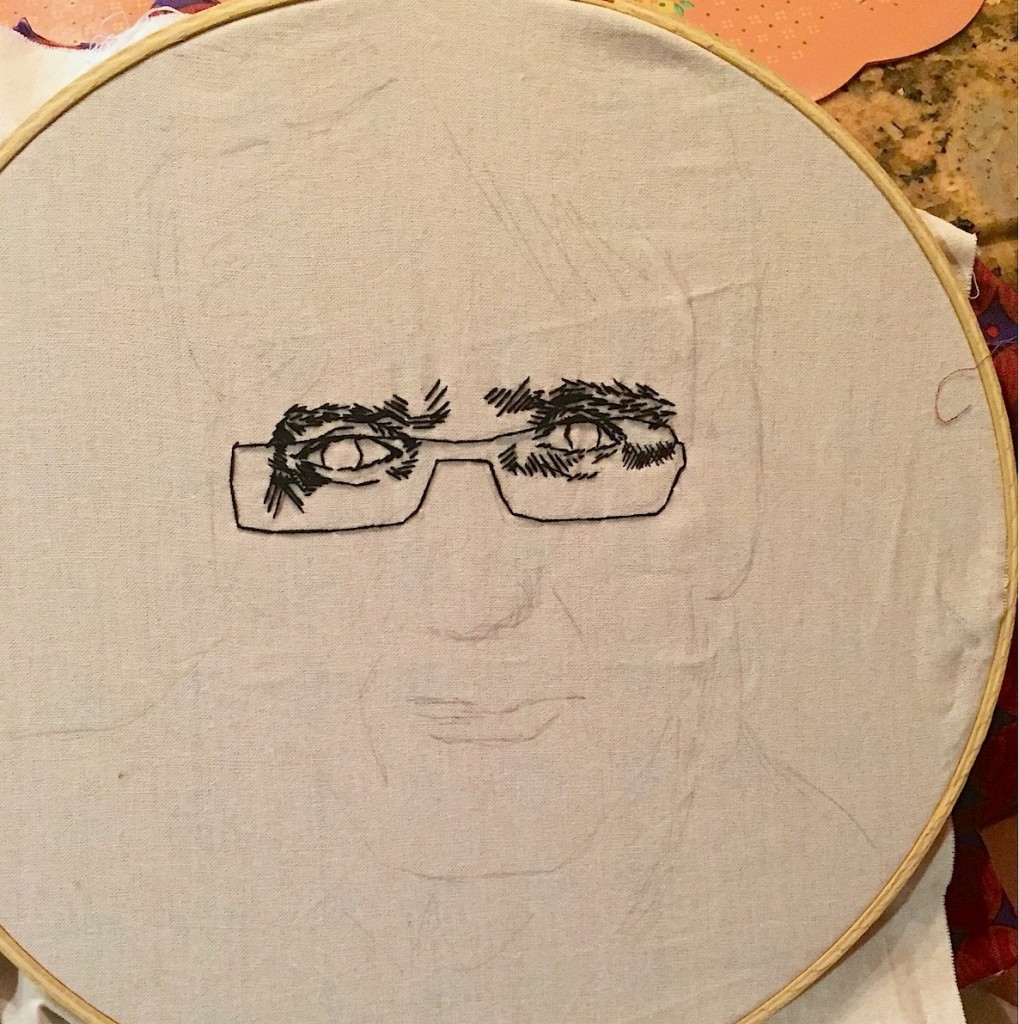
Now it looks a bit spooky and reminds me of H.G. Wells novel The Invisible Man that made a big impression on me as a teenager.
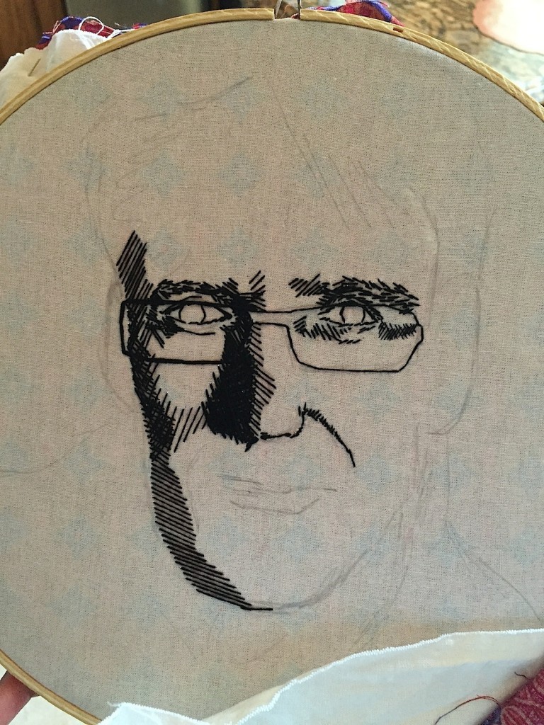
But with the outline of just one side of the face the image becomes much clearer. It may be stitched, but if you see it at this stage, then it is clear that here stitching is drawing.
Now seen from a greater distance it’s plain that the white cloth on which the portrait is taking shape lies over the red and blue patterned cloth that will form the background. Angelyn explained to me that when the portrait is completed she then cuts away the remainder of the white cloth to expose the background. This is, in fact, a very simple method, but I think a very effective one for it creates a dramatic effect without any unnecessary complication. The form comes from the tools of the medium, and she has not complicated this either, rather remained true to it and trusted it. As someone who tends to unnecessarily complicate things (who is also well aware of that problem) I greatly appreciate this drive for clarity through simplicity.
Seeing how “rough” her cover art for ROCK STARS OF WINE AMERICA #1 looked at the early stage of its making was also reassuring, because the text was also horribly rough in its early stages. Ernest Hemingway once said, “the first draft of anything is shit,” and that certainly applies to my story. I also hat to cut some material off, and to add a few things that accentuated the situation of the 25 year old me in the story. It is a story about success and failure in love and life, driven hopes and fears, lust and anxiety, and is also the story of strange rites of initiation into the way the world really works. There is, of course, some wine in it and plenty about America. It is also one of very few literary works about PR, and may be the ultimate “how NOT to” book on PR. Inexplicably, all of this does make a round whole, and that makes Aneglyn Cabrales striking cover image all the more appropriate. All the trial versions of Alexandra Weiss’ cover design were great, but I chose the one that showed the circular image with the clip and screw in fall to be faithful to this remarkable work of art.
To purchase it click on the following link:

